Project type: white-label sales platform
ROLE: Lead UX-UI DESIGNER
industry: fashion, dtf digital printing
Tools: teams, figma, figjam, illustrator & photoshop
duration: q4 2023 + q1 2024

the PROCESS:

phase 1: discover
ux research
overview:
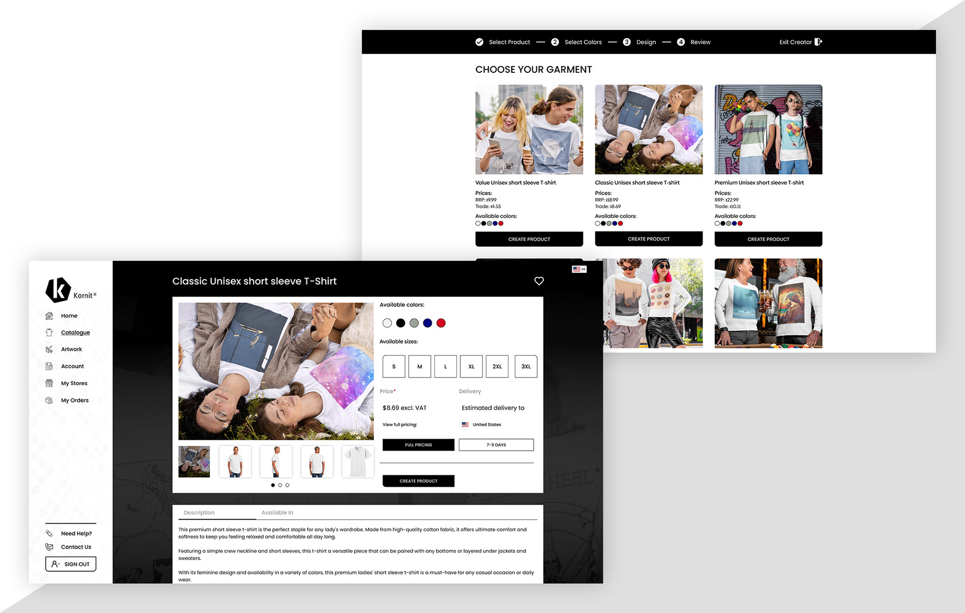
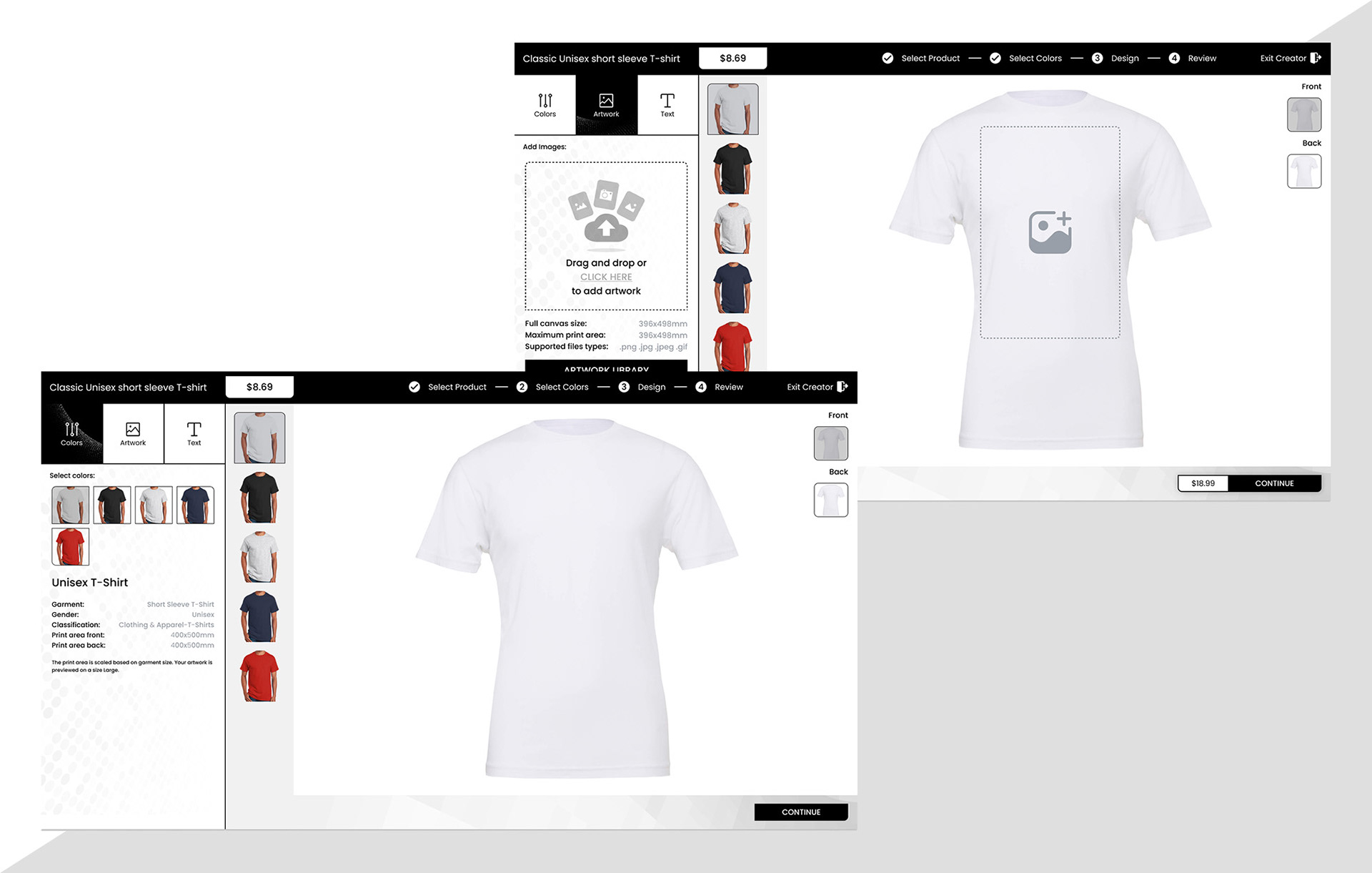
Aside from the core product offering that existing clients were using. Product had identified the need for a seperate, fashion brand lead, white label sales platform. Initially this project was under taken without the involement of the UX-UI department, and was built on the back of an existing framework. When it did eventually land on my desk, I was tasked with simply re-skinning this offering, even against my strict professional advisements. I did the best that I could, however when it came to adding in required functionality; such as the product order workflow, I had to strongly advise again that to add in the requested requirements simply would be to greater of an undertaking and a commerical waste of time and resources, as this initial iteration simply did not have the necessary UX considerations and essentially would be trying to make a square box fit through a circular hold.
After much deliberation with our technical platform manager and lead product manager, we took these concerns directly to the majority shareholders, advising why we needed to implement a proper UX and UI process. Leading a shareholder workshop, I presented my research and our findings. The case was heard and accepted. You can view the presentation document for further insight into my process by clicking the below link:
(view document here)
*Note: Unfortunately I was not able to complete this project. However, the work I did manage to complete I am still very proud of, hence why I have included it here...
OBJECTIVE:
Prioritizing the thorough analysis of competitors to gain insights into the market landscape and drive well-informed decisions is crucial. I meticulously compared the features, strengths, and weaknesses of three prominent online DTP (Direct to Print) competitor sites: Printful, Creator Studio, and Gelato. Through this process, I was able to identify common strengths and weaknesses among these competitors, which in turn informed our own product development strategy by highlighting aspects to emulate and pitfalls to avoid.
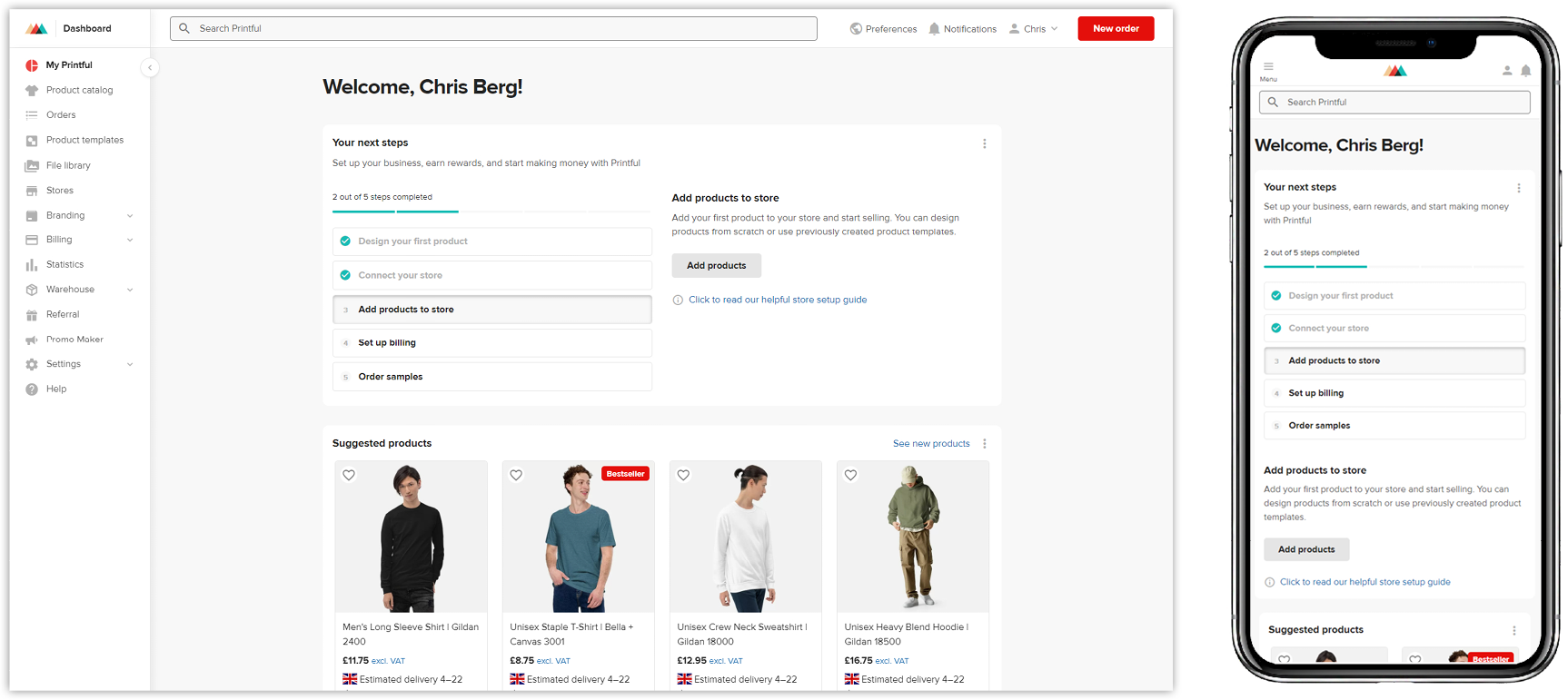
Competitor 1: Printful
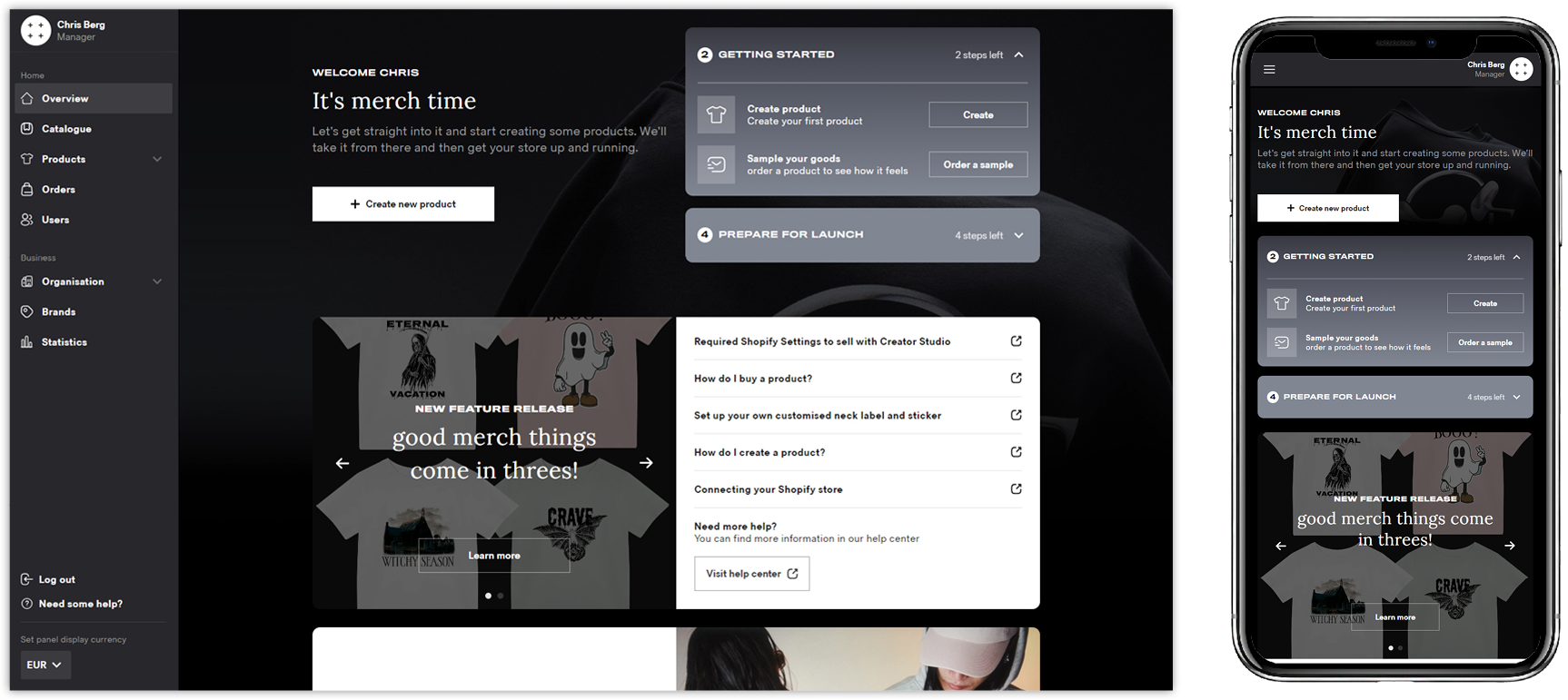
Competitor 2: Creator Studio
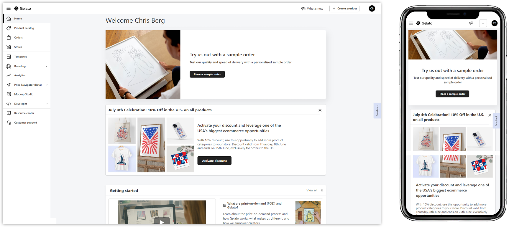
Competitor 3: Gelato
empathy map:
USER PERSONA:
In order to gain a deeper understanding of our target user demographic, I initiated the use of an empathy map. This tool enabled us to comprehend our users' thoughts, actions, and emotions more effectively.
As an experienced UX designer, I start by studying how people use a product and what they need. Based on this research, I create a detailed user persona including their needs, goals, and habits to design a product that meets their needs.


PHASE 2: DEFINE
UX DESIGN:
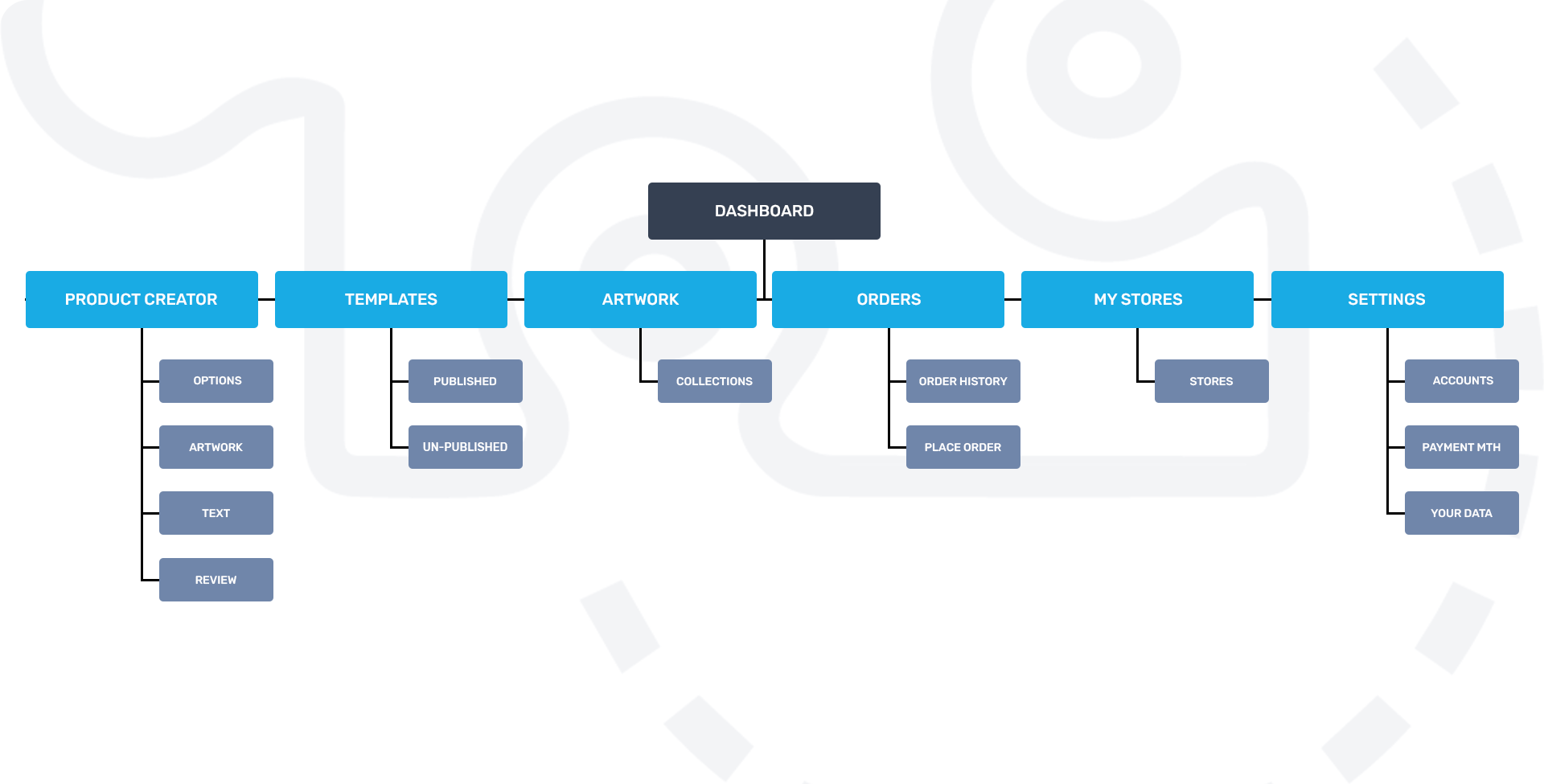
SITEMAP
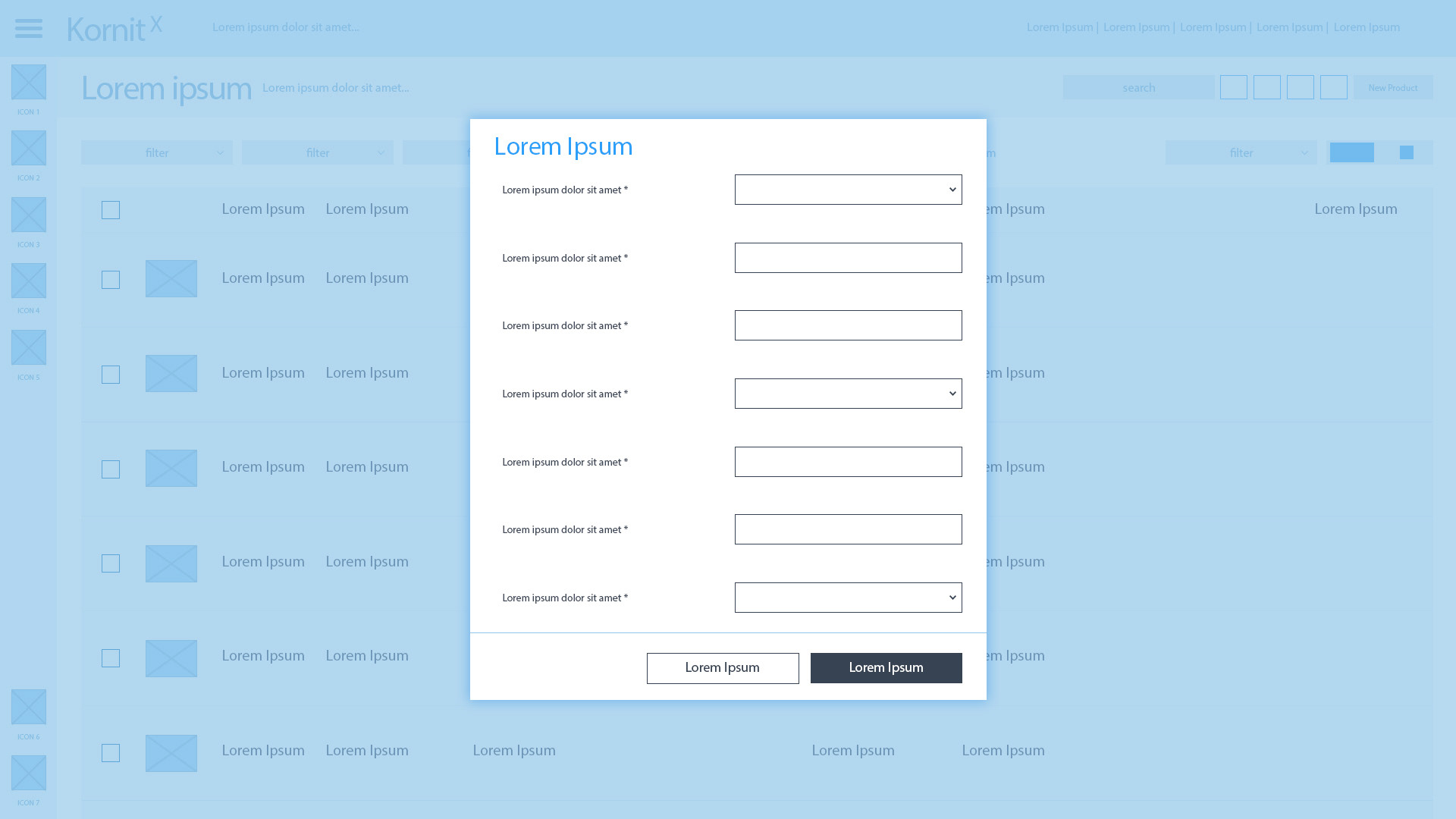
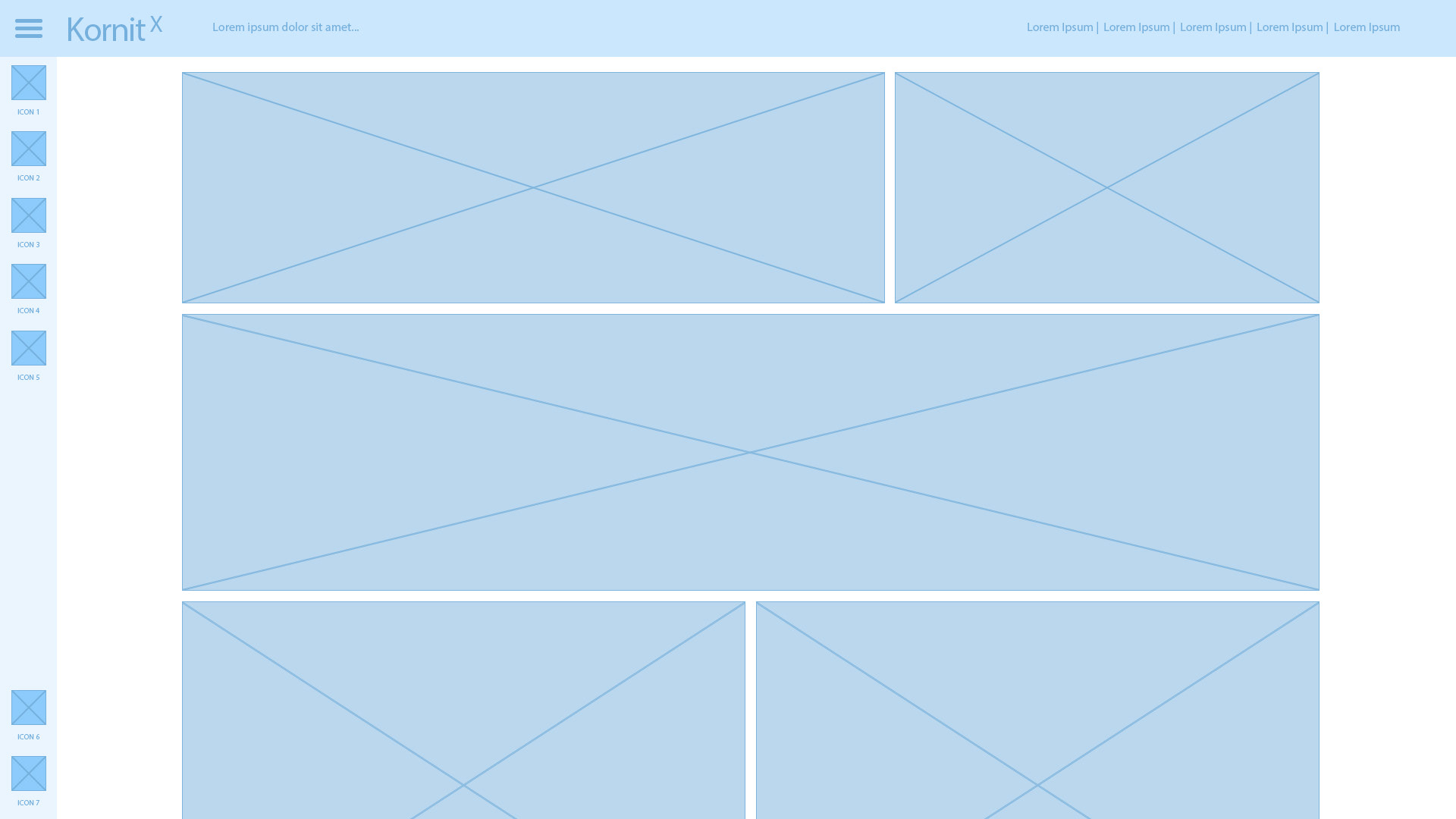
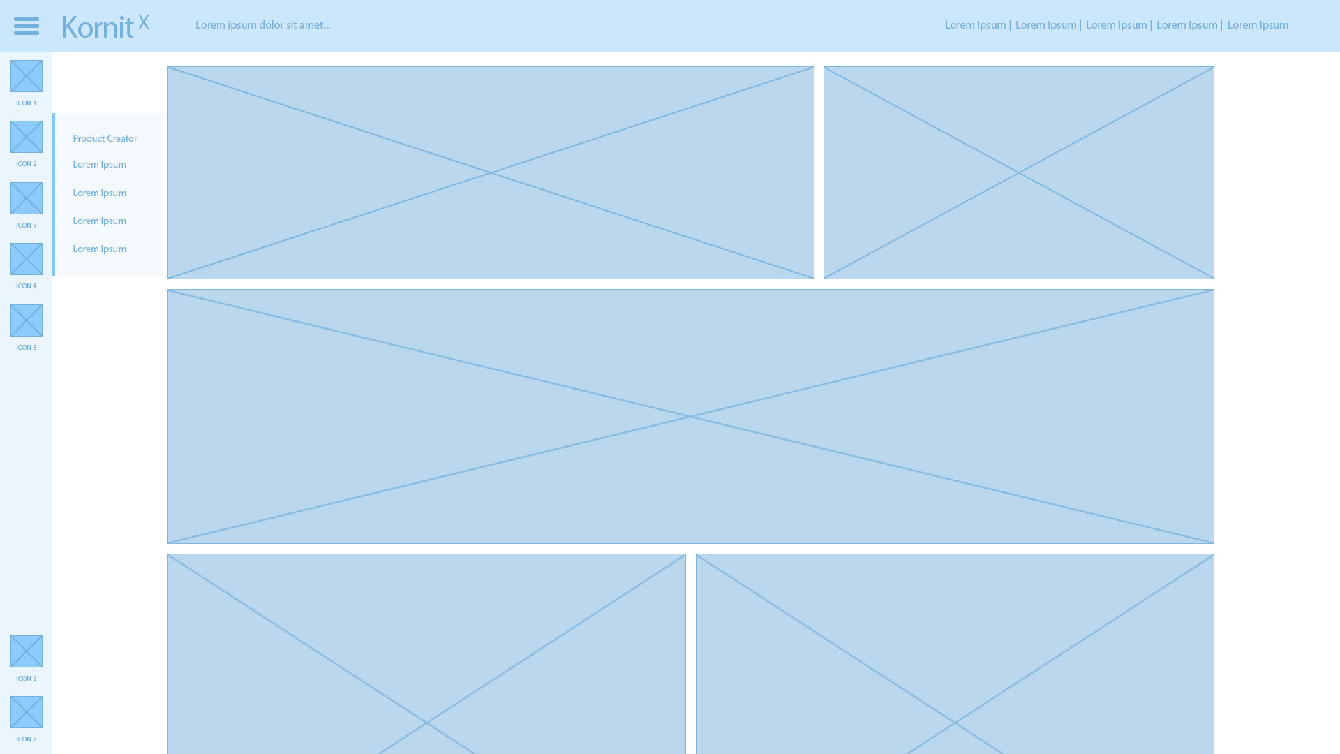
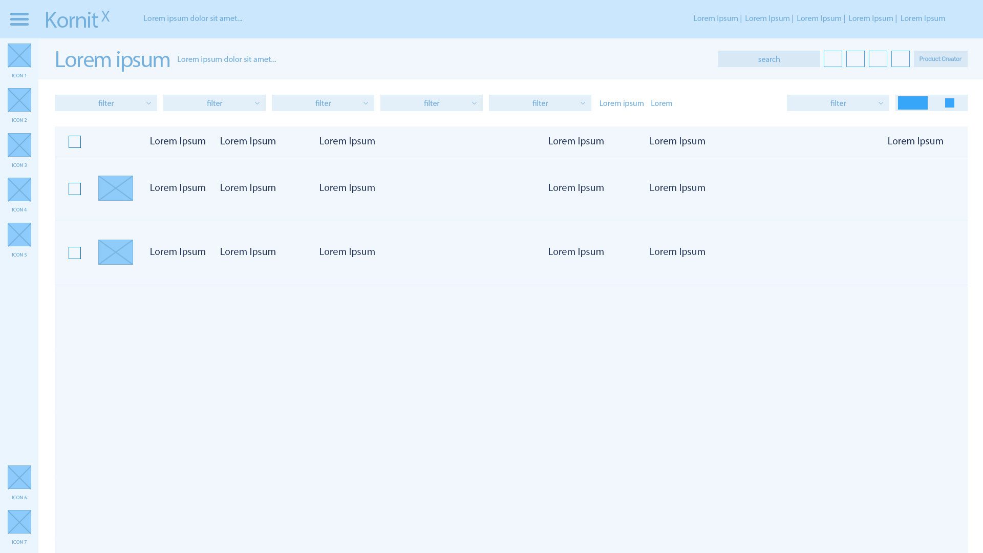
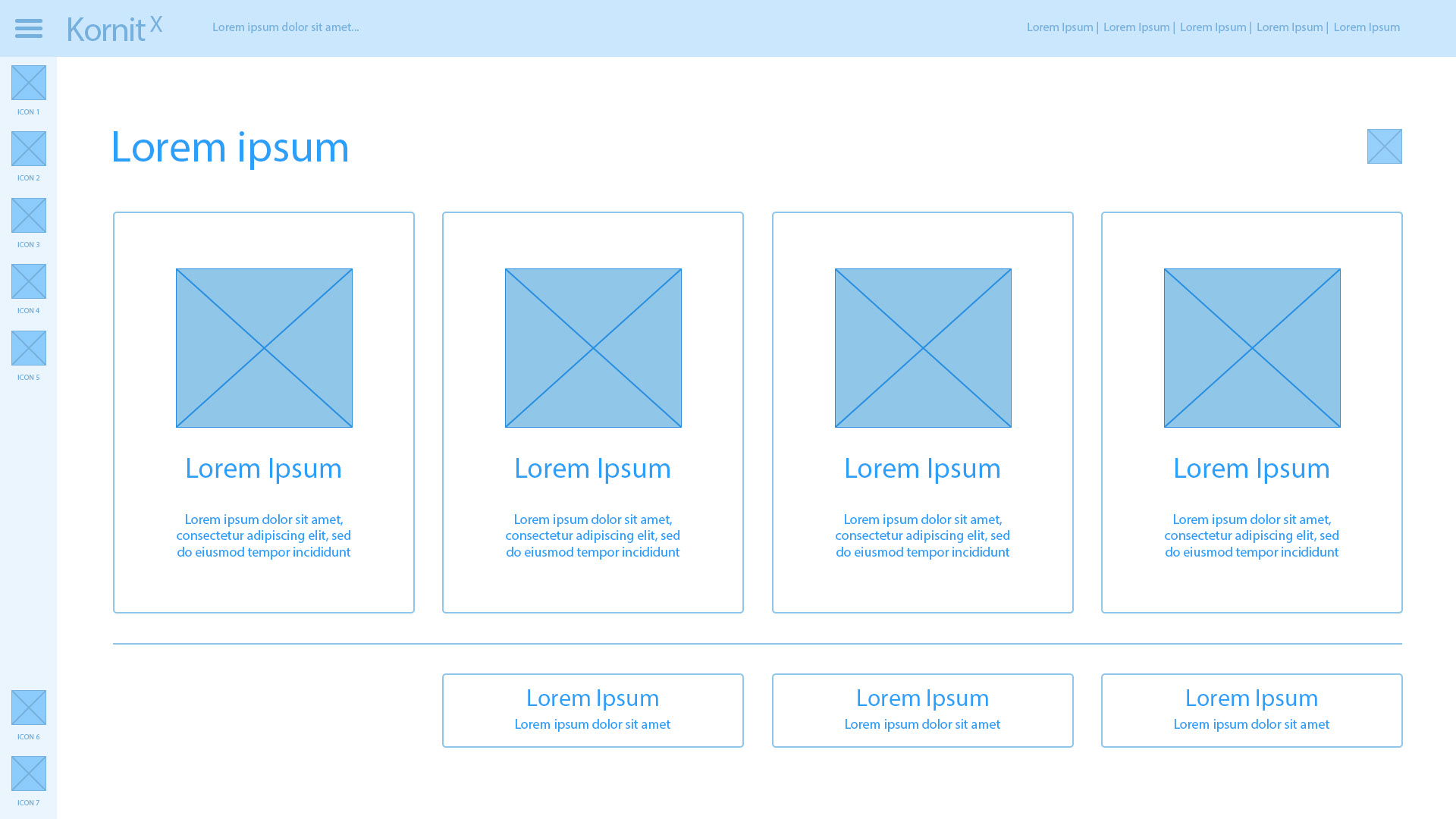
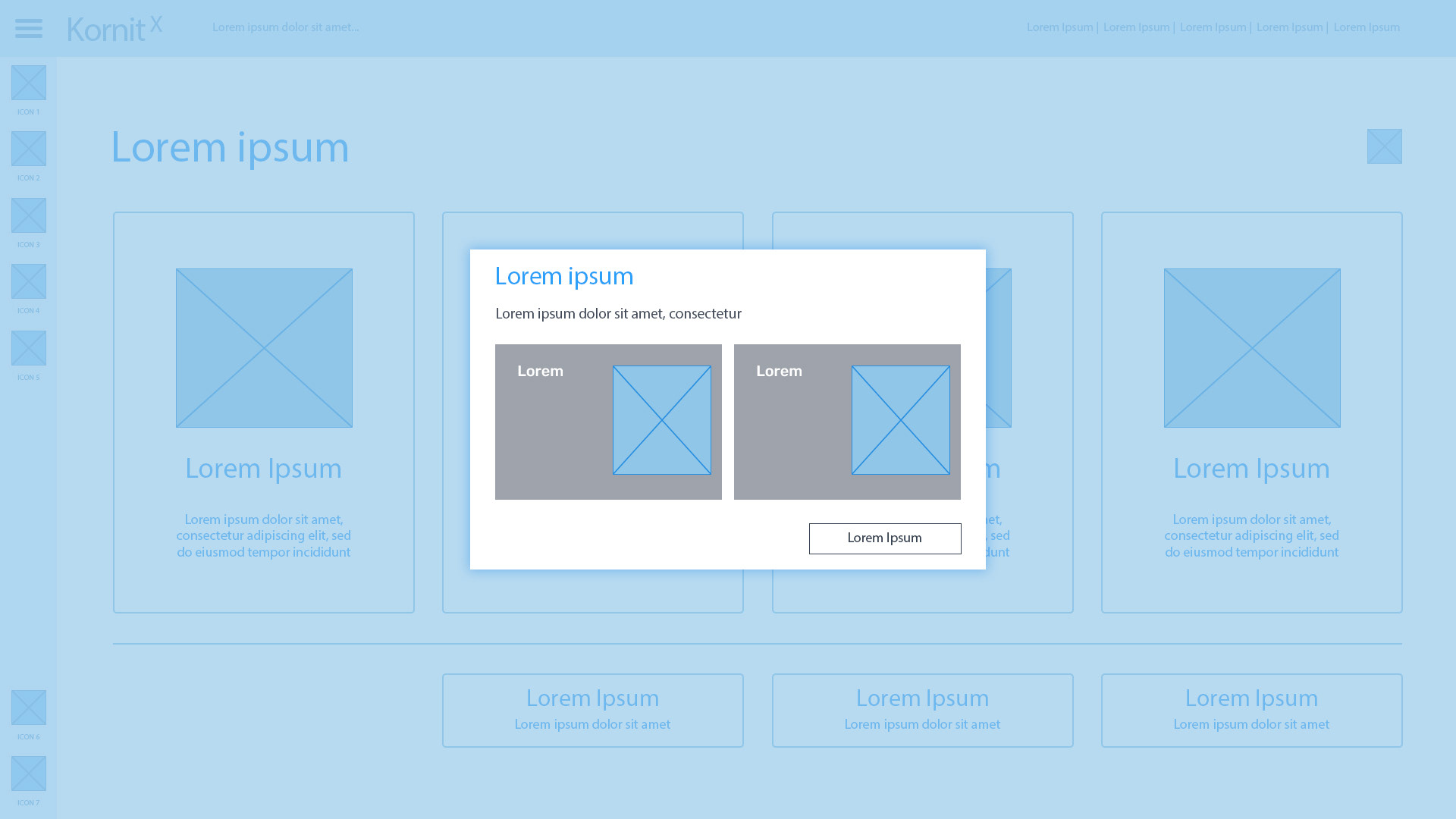
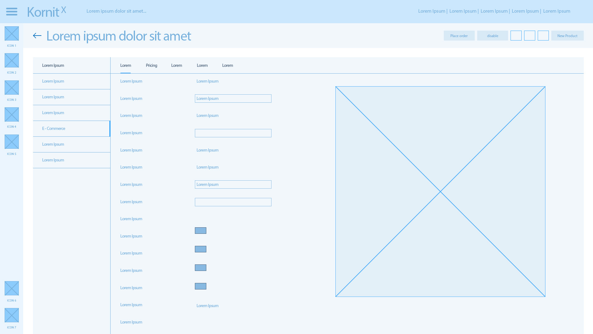
WIREFRAMES


PHASE 3: DEVELOP
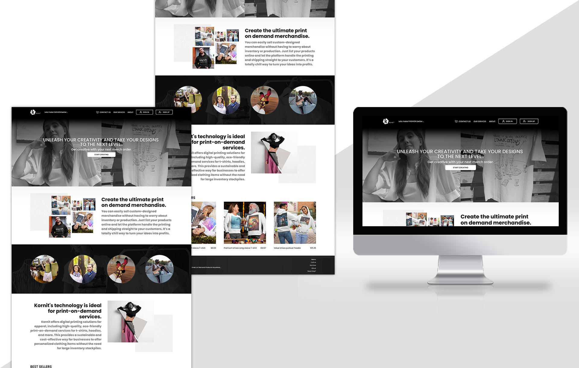
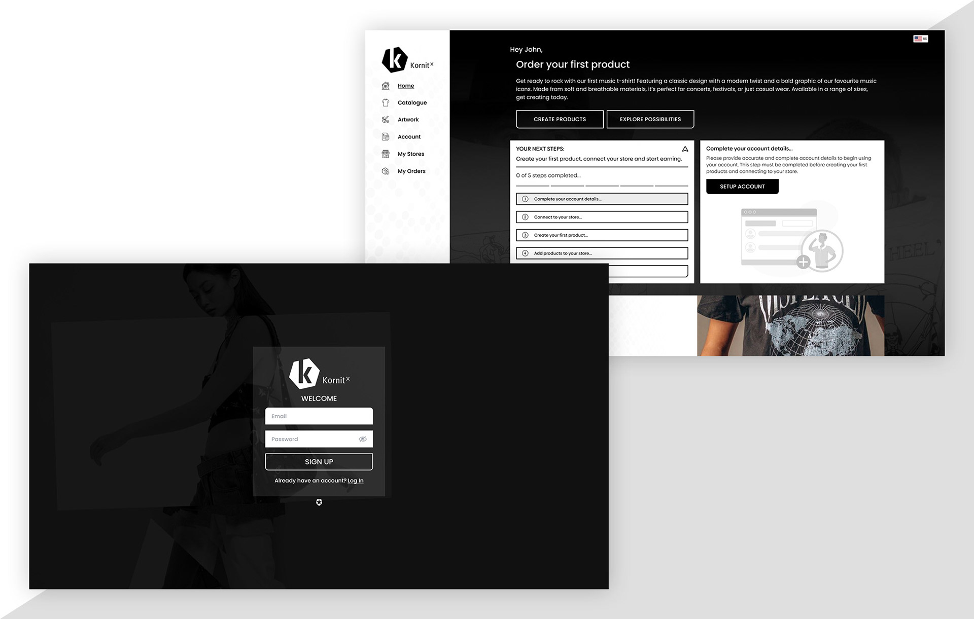
UI DESIGN:
BRANDING
UI KIT
HIGH-END VISUALS